Dealing with artifacts when plotting contour lines of curvilinear data
Sometimes plotting contourlines of some curvilinear data sets, such as the NASA Team/Bootstrap data, can lead to unwanted artifacts. Let’s assume we loaded the netCDF with xarray and want to plot the 15% SIC contour line for a specific time step.
First, we load some packages and the data set:
[9]:
import xarray as xr
import matplotlib.pyplot as plt
import cartopy.crs as ccrs
import my_code_base.plot.maps   # for "polar" accessor
[12]:
da = xr.open_dataset("sic_nasa.nc").sel(time="2021-03-01").siconc
Now, simply plotting the data on the polar-stereographic projection woud produce a weird looking result:
{margin} ```{seealso} The features of the map (round shape, ruler, labels, etc.) have been applied via the {meth}`~my_code_base.plot.maps.StereographicAxisAccessor.add_features` method of the {obj}`polar <my_code_base.plot.maps.StereographicAxisAccessor>` accessor. ```
[11]:
ax = plt.subplot(projection=ccrs.NorthPolarStereo())
da.plot.contour(ax=ax, x='lon', y='lat', transform=ccrs.PlateCarree(),
                levels=[15], colors=['r'], zorder=10)
ax.polar.add_features()
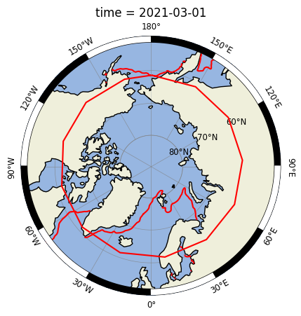
The contour lines are placed correctly but the polygons are not properly wrapped around the antimeridian.
This problem is discussed and addressed in the following threads:
The solution is the function z_masked_overlap they propose in these threads. Just copy it either from the github site or from here, and apply it to your data.
Here, I wrote a small wrapper function ({obj}~my_code_base.plot.z_overlap.fix_overlap) to make it easier to use:
[8]:
from my_code_base.plot.maps import fix_overlap

ax = plt.subplot(projection=ccrs.NorthPolarStereo())
da = fix_overlap(da, ax)
da.plot.contour(ax=ax, x='lon', y='lat',
                levels=[15], colors=['r'], zorder=10)
ax.polar.add_features()
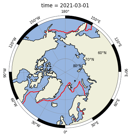
Et voilà! 🚀
{note} 👉 Note that after applying {func}`~my_code_base.plot.z_overlap.fix_overlap` we don't specify the `transform` option in the plot command!